
|
|
Home
| Databases
| WorldLII
| Search
| Feedback
Law, Technology and Humans |
Keeping Up Textual Appearances: The UK Road Vehicles (Display of Registration Marks) Regulations 2001
Thomas Giddens
University of Dundee, United Kingdom
Abstract
Keywords: Road Vehicles (Display of Registration Marks) 2001; textual appearance; legal aesthetics; materiality; power.
1. ‘On Which Nothing Turns’
Embedded in the typography of its transcript, there is a secret message encoded in the judgment of Baigent v Random House.[1] The case involves a copyright claim against Dan Brown’s The Da Vinci Code[2] and the cryptophilic novel inspired the trial judge Smith J to transmit a secret ‘smithy code’ of his own by strategically formatting bold and italic letters throughout his written decision.[3] On appeal, these typographic shenanigans were given short shrift by the appellate judges, who mention the ‘smithy code’ just long enough to denounce its substantive relevance, a determination that also rejects the significance of the visual formatting used to encode the message. The visual appearance of law’s textual form may articulate meanings, but they are meanings ‘on which nothing turns’.[4] Indeed, one might consider the appearance of law’s words of negligible significance in relation to their doctrinal and analytical meanings, or their social and political effects. While it may have some potential for carrying meaning, nothing substantive turns on one’s font choice or page layout; instead, everything turns on the content of the words used.
However, if this were the case, why would Baigent’s appellate justices feel the need to mention the smithy code at all, if not precisely because the textual appearances of legal authority do, in fact, matter? Perhaps the concern is simply practical: the clear and accessible presentation of legal documents and regulations is vitally important if they are to communicate the law or have concrete effects. Indeed, where the visual presentation of text is consciously discussed in a legal context, the concern is exclusively with practical readability and the efficient communication of substance. Here, ‘bad’ typographical practices hinder the practical operation of documents that must be read efficiently by lawyers and judges.[5] The burgeoning ‘legal design’ movement is a case in point and seeks to improve legal practice and access to justice via principles of clear, efficient communication and end-user-oriented document design.[6]
Thus, beyond legibility, the visual appearance of words may not appear overly important: it is the decision of the judge or the speed limit of 30 miles per hour that is legally significant, that creates or contains an obligation for legal subjects or articulates a normative force in society, not the size and shape of the characters used to communicate it. When we see and interpret written words, we should be seeking their content, with their appearance being largely irrelevant. Indeed, Lyotard argues that we are educationally and culturally conditioned to ignore visual form in favour of intellectual content when reading. [7] He claims that the reader ‘does not see what she or he reads, striving instead to hear the meaning of what the absent speaker—the author of the text—“meant to say” ’.[8]
But regardless of legibility, certain forms of visual presentation, including particular typefaces, can accumulate associations that render their use problematic or dangerous in certain situations—an issue exacerbated in the field of law, with its potential for wide-ranging constitutive effects. Imagine Supreme Court judgments reported via the much-maligned Comic Sans,[9] or decisions of the European Court of Human Rights appearing in the Fraktur fonts of National Socialism.[10] The legal question is not whether law has a textual appearance (it clearly does, for that is how we are able to read it), but to what extent that appearance is relevant in understanding law as a normative institution. While Baigent holds the extent of this relevance to be nothing at all, this article contends that there is not only practical and symbolic significance in textual visuality, but also a wider importance in terms of the material articulation of law’s normative force within society.
The printed word is a central part of the broad set of textual and non-textual mechanisms by which modern law can be encountered. By engaging the example of vehicle license plates (particularly the explicit legal controls governing their visual appearance within the United Kingdom (UK) jurisdiction), this paper will explore how legal power is inscribed into textual form. The term ‘registration marks’ will be used throughout, as this is the UK’s technical legal nomenclature for the content of what is displayed on a vehicle via what is variously called its license plate, number plate or registration plate. Registration marks form part of the wider reliance upon textual articulation in state governance, and the detailed control of registration marks in UK legislation and thus indicates a concern not only with the practical and ideological dimensions of the materiality of printed type in the transmission of regulatory effects, but also the way authority is embedded into the very form of the textual mediation between individuals and the legal institution.
The first half of the article presents a focused engagement with the UK’s 2001 Regulations, examining and highlighting the explicit and detailed nature of these regulations, which demonstrates a deep concern with the specifically visual appearance of registration marks beyond their practical purpose (Section 2, ‘Regulating Marks’). The second half then works ‘outwards’ from these regulations to interrogate their significance as an example of the institutional control of textual appearance. Registration marks are highlighted as part of the textual and communicative structures of modern legal regulation, tracing their strong linkages into the wider phenomenon of textual inscription of legal power across the emergence of the modern state (see Section 3, ‘Inscriptions of the State’). Over the course of the discussion, it will become apparent that there is concern with the visuality of the texts used to regulate society and thus, when we read the law, we are not simply decoding intellectual content, but also navigating the typographic lines and forms used to articulate the textual transmission of legal power, and are thus encountering the intricate material inscriptions of sovereignty.
2. Regulating Marks
Registration marks connect vehicles to the state, enabling their regulation. In the UK, they are created under the statutory authority of the Vehicle Excise and Registration Act 1994 (the ‘1994 Act’)[11] initially as a means of administering vehicle taxation through the licensing of road vehicles,[12] but are of much wider significance. Cars and other motor vehicles are intricately regulated objects, not only in terms of their taxation or the health and safety aspects of their upkeep, but also in their ownership, sale and public use. The ownership of a vehicle must be registered, including multiple details about the vehicle (its age, colour, engine size, etc.), and the state must be notified of changes in ownership. Vehicles must undergo regular safety checks to be used on public highways—and this use is regulated with speed limits, rights of way, safe driving requirements and a host of traffic laws that shape the conduct of legal subjects as they drive on the road.
Accordingly, vehicles can be tracked and traced—not just for the purposes of administering taxation, but for traffic management, parking fee collection, tracing ownership, criminal investigation, and national security. And the administration of all of this vehicular control is made possible by registration marks. These are unique and allocated to individual vehicles; thus, they increase the legibility of each automobile within the armature of state. They are the mark of the law stamped upon the vehicle to give it legal identity,[13] a form of legal name that makes it institutionally perceptible and thus able to be regulated in a practical rather than just a conceptual sense. Therefore, registration marks are a fundamental aspect of the practical management of all aspects of road use, and offer significant crime control and security benefits by enabling authorities to track legal subjects through their vehicles.
Registration marks are important tools of governance, part of the range of devices through which the modern state seeks to manage society.[14] They do not contain obligations: they are not a ‘source’ of law as the texts of judgments and statutes are commonly understood to be. Instead, they are a pragmatic mechanism that subsumes vehicles into the regulatory architecture of the state. Importantly, it is not just the existence of the mark that enables this—it is its display. Vehicles also have a Vehicle Identification Number that specifies it,[15] but these are hidden and difficult to see. In contrast, registration marks must be affixed to a vehicle and be visible and legible; thus, they enable the practical control of vehicles and their users on an everyday basis. While a linkage might exist, an unmarked car cannot easily be connected to its legal identity, and so becomes difficult to regulate properly. It is the registration mark—as something physically and materially affixed to a vehicle and in full view—that actually enables its practical regulation in this context. On a practical level, it is precisely the material encounter with a registration mark that links a vehicle to the wide ranges of regulation that seek to normalise or limit the maintenance and use of vehicles—as well as aspects of the conduct of their owners within society. The displayed mark is the mediating point between the general content of regulations and the specific regulated vehicle, enabling the content of legal norms to have practical effects. In this sense, an unmarked car would fall outside the practical regulatory framework of the state, signifying something beyond the reach of the sovereign—the display of a registration mark keeps the object, its use and its owner, within the normative order.
2.1 The Prescribed Font
The primary level on which registration marks are materially encountered is visual: they are seen on the fronts and backs of road vehicles across the country—indeed, the globe. As an important point of contact between vehicles and state, the manner of this display is significant. While different jurisdictions have a variety of requirements pertaining to this display, with a greater or lesser degree of specificity, in the UK, the requirements are highly prescriptive. It is the 2001 Regulations that articulate these specifications, under the statutory authority of the 1994 Act. And the font that is used to inscribe vehicles with registration marks in the UK is distinctive, being a bespoke lettering style that was specifically designed for this purpose, and one that is now widely associated with UK registration plates in the popular imagination as ‘the number plate font’. Currently contained in sch 4 of the 2001 Regulations, it is reproduced in Figure 1.
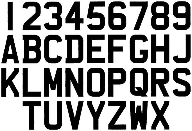
Figure 1 . ‘Font Described for Characters 79 Milimetres in Height [sic]’ from 2001 Regulations, sch 4 pt 1
Originally designed in London in 1935 by the sheet metal pressing company Charles Wright and Son,[16] this prescribed font represents a font of specifically English origin that is imposed on vehicles across the UK. It was updated in 2001 to allow for changes in European regulation (the inclusion of the EU country identifier) and technology (digitally printed acrylic now enables more precise characters and thus optimisation for optical character recognition).[17] These basic reforms already indicate some concern with the appearance of these marks, but the full regulations go beyond simply prescribing a font. The 2001 Regulations’ detailed intervention in how registration marks should be displayed suggests that the manner of their presentation is important: it is not simply that they must be legible, but that a specific size, style and arrangement of the marks on registration plates must be adhered to. Thus, the 2001 Regulations indicate that the point of mediation between a vehicle and the UK state should take a particular form and format—that the visual appearance of these regulatory tools matters. The obvious presumption is that this appearance matters simply for their practical functioning, but the detail and extent of the visual control exerted by the 2001 Regulations indicates that they are of wider significance, as will be explored in the second half of the paper.
There is some limited jurisprudence on the UK regime surrounding registration marks, but none of it directly discusses the visual appearance of marks or the content of the 2001 Regulations. For instance, while Value Added Tax is payable on the sale of personalised registration marks by the UK’s Driver and Vehicle Licensing Agency (‘DVLA’),[18] there is no property in registration marks themselves,[19] with such purchases being contracts for the transfer of a registration number to the buyer’s vehicle via prescribed statutory mechanisms, rather than for the purchase of the mark as an object or a thing in action.[20] Accordingly, it is the statutory regime itself that will be the focus of the following discussion.
Registration marks are created ‘in such a manner as [the Secretary of State] thinks fit’,[21] with the only guidance being that the mark indicate the ‘registered number of the vehicle’.[22] While there are numerical elements in some registration marks (today, UK registration marks have a two-digit ‘age identifier’ that indicates the year the vehicle was registered[23]), overall, the characters of a mark do not operate within the arithmetic functions typically associated with numbers. And while contemporary registration marks also contain a ‘memory tag’—the first two characters that encode the geographic location of the vehicle’s registration[24]—marks do not seek to incorporate existing linguistic terms either. Indeed, this is consciously avoided where a mark resembles a term that is offensive or politically dubious in the UK context, be it in the three random letters at the end of the mark (e.g., ‘FUK’) or over the whole registration plate (e.g., ‘BA57 ARD’ or ‘HE58 OLA’).[25] Thus, the content of a registration mark is not a number or a pre-existing word, but is something created within the regulatory systems of law itself.
The regime of the 2001 Regulations is explicitly about visual form: it governs the visual aspects of vehicle registration marks, delineating the appearance of the displayed figures, including ‘the size, shape, and character of the registration marks’[26] and the manner in which they are ‘rendered easily distinguishable’.[27] It is ss 14 and 15 of the 2001 Regulations that are most significant in this regard: s 14 determines the ‘size and spacing of characters’, with s 15 then prescribing the ‘style of characters’. The various character heights in s 14 are determined by the age and type of vehicle, with each height referring to a respective set of measurements in ‘Table B’ (see Table 1).
Table 1. ‘Table B: Stroke and Character Width, Spacing and Margins’ from 2001 Regulations, sch 3 part 3
|
(1) Relevant dimension
|
Relevant character height
|
||
|
|
(2) 89 mm
|
(3) 79 mm
|
(4) 64 mm
|
|
1. Character width (all new registration plates from 1.9.01 except
replacement of “classic” plates)
|
—
|
50 mm
|
44 mm
|
|
2. Character width (other registration plates)
|
64 mm
|
57 mm
|
44 mm
|
|
3. Stroke width
|
16 mm
|
14 mm
|
10 mm
|
|
4. Space between two characters within group: general rule
|
13 mm
|
11 mm
|
10 mm
|
|
5. Horizontal space between groups
|
38 mm
|
33 mm
|
30 mm
|
|
6. Vertical space between groups
|
19 mm
|
19 mm
|
13 mm
|
|
7. Minimum margin
|
13 mm
|
11 mm
|
11 mm
|
|
8. Pressed/embossed plates fixed before 1.9.01 and “classic”
plates: space permitted between “I” or “1”
and another
character
|
13 to 37 mm
|
11 to 33 mm
|
—
|
|
9. Pressed/embossed plates fixed before 1.9.01 and “classic”
plates: space permitted between characters if both “I”
or
“1”
|
13 to 60 mm
|
11 to 54 mm
|
—
|
The current normative measurements—for vehicles registered after 2001—relate to a character height of 79 mm; accordingly, Table 1 gives the following: 50 mm character width, 14 mm stroke width, 11 mm character spacing, 33 mm horizontal spacing between character groups, 11 mm minimum margin and 19 mm vertical line spacing (e.g., on squarer motorcycle plates that break the registration mark over two lines). The stylistic dimension is determined by s 15, which gives legislative backing to the font presented in Figure 1. (There is some variation permitted where there is ‘substantial similarity’ to this prescribed font.[28]) Figure 2 diagrams the complete regulatory requirements for the display of registration marks, incorporating both the sch 4 font style and the current required measurements for new vehicles set out in Table 1. As if this close-knit regulatory framework was not already detailed enough, s 12 determines things further by adding error bounds: s 12(2) specifies permissible variations for all measurements, with s 12(2)(a) providing a margin of ± 1 mm for character height and s 12(2)(b) stating the even finer requirement of ± 0.5 mm for all other measurements (character width, stroke width, margins and spacing).
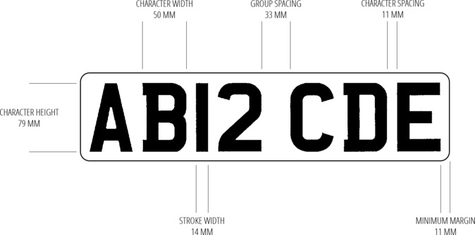
Figure 2. Diagram of Registration Plate Visual Design Requirements, following the 2001 Regulations
The intricacy of these regulations indicates a regulatory desire for these figures to have a particular appearance. Meanwhile, the error bounds in s 12(2) indicate a degree of practical concession, accepting that the imagined form remains contingent upon a material—and thus imperfect—expression of the legally described ideal. Indeed, it is arguably impossible to encounter registration marks as purely intellectual or idealised legal objects, since they are invariably contingent upon some form of material expression—be it via indicative description in the 1994 Act, the graphic expression mandated by the 2001 Regulations or a sensory encounter with affixed marks themselves. The recognition of this contingency is in a sense ab initio: in typographic parlance, the typeface is the ‘design of the letterforms’, the ‘punches from which molds are made’, the ‘visual design’ in a digital system, while the font is the ‘delivery mechanism’, the ‘cast metal’, the ‘software that allows you to install, access, and output’ the text.[29] By denoting the prescribed letterforms as a ‘font’ rather than a typeface, the 2001 Regulations acknowledge their material contingency from the moment of their initial description.
While Comic Sans has attracted negative meanings in its various inappropriate uses in formal settings,[30] as have Fraktur fonts through their association with National Socialism,[31] the meanings accumulated by the UK’s prescribed font orbit its bureaucratic praxis. The prescribed font was created for a specific administrative purpose and remains embedded within the pragmatic pursuit of that purpose. The 2001 Regulations included reforms targeting the practical concerns of readability and compliance: serifs on ‘B’ and ‘D’ distinguish them more clearly from ‘8’ and ‘O’; ‘P’ and ‘9’ are now more difficult to disguise as ‘R’ and ‘8’; and the lack of ‘I’ eliminates confusion with ‘1’ (see Figure 1).[32] More substantively, a recurring concept in the 2001 Regulations is the requirement for the characters to be ‘easily distinguishable’.[33] This term derives from s 23(4)(b) of the 1994 Act, which permits the Secretary of State to prescribe, via regulations, ‘the manner in which registration marks are to be displayed and rendered easily distinguishable’. This guiding requirement can also be detected in the style of the prescribed font itself (see Figure 1), which works to maximise clarity of form.
There is much variation in how typefaces are classified, but a leading taxonomy instituted by the Association Typographique Internationale in 2010 would likely place the prescribed font as a form of ‘geometric sans’, with its ‘uniform ... and geometrically precise strokes’ that seek an ‘ “aesthetic-free” aesthetic’ and prioritise function over artistry.[34] Lupton explains an arguably higher-level distinction in font classification: ‘Humanist letterforms are closely connected to calligraphy and the movement of the hand ... and modern typefaces are more abstract and less organic’.[35] As Kostelnick and Hassett also note, sans serif typefaces are generally associated ‘with the machine-age aesthetics of modernism’.[36] Using these reference points, the prescribed font can be said to reflect a high degree of modernism in its reliance upon abstract geometric forms—its strokes are thick, solid, consistent and without adornment—with minimal reference to humanistic traces of calligraphic styles (serifs, loops, variable line width, organic curves). Even where calligraphic style is deployed (the serifs on ‘B’ and ‘D’), as noted above, this is done precisely and exclusively to maximise legibility.
Compared to the rich variety of typographic styles and design choices available, the UK’s prescribed font displays a blocky pragmatism that is in line with a utilitarian regulatory praxis. The overt preference for abstract, clear, objective form also reflects dominant ideals identifiable in relation to modern law, which arguably or ideally operates on principles of abstract generalisation, clarity of articulation and objective decision-making that is not disturbed by subjective bias. Moreover, law is too important, serves too serious a function, to be adorned with frills and twirls—because law is a serious business, it must be boring lest it be accused of lacking the appropriate gravitas of its core regulatory and juridical functions.[37] Thus, the prescribed font rejects decorative trappings and presents these regulatory devices as direct, unmediated, clear and without subjective expression. The prescribed font’s visual style indicates an aspiration towards a font that embodies a purely pragmatic and unbiased letter-form, articulating the pure ideality of the character without the contingency or subjectivity of material mediation getting in the way. Such a font is a perfect vehicle for transmitting an emanation of the modern and serious institution of law that oscillates between general rules and pragmatic application.
But this utilitarian ideal is imperfectly realised in the expression of the marks, with those marks being impinged upon by other material factors. Alongside the state authority that institutes the existence and appearance of registration marks, these contingent influences also leave their traces on the form: for example, material variations in the size and shape of characters, the name given to the typeface itself (i.e. ‘Charles Wright 2001’), the subtle reimagining of the font in professional type design to maximise readability,[38] the substances used to express the mark, and the graphic and vehicular context within which the marks appear. Thus, the inscription of these marks is deeply ingrained with the material contexts of its emergence and encounter, with the multiple sources—not just institutional intention, but also wider areas of manufacturing, design and technology—leaving their trace upon the marks that then inscribe vehicles on UK roads. This is not an example of law being understood in a context: this integration is unavoidable to the extent that these legal instruments are mediated through material artefacts.
2.2 The Relevant Area
The 2001 Regulations recognise that their dense prescription of registration marks is meaningless if there is no-one to witness the careful precision with which they should be presented. In addition to regulating the appearance of the marks, the 2001 Regulations define a spatial arena specifically for witnessing registration marks. In doing so, they imagine an audience of legal subjects for whom these words are displayed. This space, defined in s 4 of the 2001 Regulations, is called the ‘relevant area’:
“relevant area”, in relation to a registration plate, means the area contained in a square described on the ground—
a) in front of the vehicle in the case of a plate fixed on the front of the vehicle, and
b) behind the vehicle in the case of a plate fixed on the rear of the vehicle,
where one corner of the square is immediately below the middle of the plate and the diagonal of the square from that corner is parallel to the longitudinal axis of the vehicle.
Beyond incorporating the modernist purity of geometry that is also reflected in the style of the prescribed font, and that is consistent with modern scientific conceptions of objectively stable space that underpin other areas of modern legal regulation,[39] the relevant area is defined exclusively in relation to the vehicle upon which a registration plate is fixed—another acknowledgment of the material contingency of the display of these regulatory marks. This area also encompasses two simultaneous permutations: one before and one aft the vehicle, located respective to the registration plates themselves. These relevant areas move wherever the vehicle moves, parting the conceptual way ahead and leaving an imaginary wake as legal subjects go about their daily business on the roads.
Indeed, the relevant area is a dynamic space: ss 5 and 6 of the 2001 Regulations specify its variable features and govern the rear and forward areas, respectively. By ss 5(5-6) and 6(3-4), the ‘diagonal length’[40] and thus the size of the area is determined in relation to the character width of the displayed mark (under ss 5(6)(b) and 6(4)(b), the standard size relative to post-2001 plates is a diagonal length of 21.5 m). As both ss 5(5)(b) and 6(3)(b) specify, plates should also be affixed such that from anywhere within these respective relevant areas, and ‘in normal daylight conditions, the characters of the registration mark are easily distinguishable’. These textual forms should also not be obscured by something as inconvenient as the sun setting: accordingly, a combination of ss 9(2) and (5) prescribe the use of lighting ‘between sunset and sunrise’[41] such that the rear marks remain ‘easily distinguishable from every part of a relevant area’[42]—the diagonal length again being determined by the character width (except for characters 44 mm wide, the diagonal length is 18 m[43]). Figure 3 visually summarises these requirements.

Figure 3. Diagram of the ‘Relevant Area’ as defined by Section 4 of the 2001 Regulations
Accordingly, the size of the relevant areas varies depending on two factors: whether it is day or night, and the lettering used for the registration mark. These two factors span a huge range. First, the astronomical events of sunset and sunrise, which are primarily determined by the earth’s position in its annual orbit around the sun: this position affects both the number of daylight hours and when sunrise and sunset occur, and consists of an elliptical journey just shy of one billion kilometres.[44] Second, the width of the characters on the registration plate, which is measured to within half a millimetre.[45] The significance of the astronomical measurements may stretch credulity, with the simple practicality of sunrise and sunset as delimiting criteria perhaps being a more reasonable reading of this definition. However, when defining geographic areas in statutory drafting, there is often a trade-off between precision and pragmatic simplicity.[46] The latter is favoured in the 2001 Regulations, which connects the definition of the relevant area to the movements of planetary bodies: the 2001 Regulations use a conjunction of astronomy and type design to specify the expression of this legally created space. It is a site where the vastness of extra-terrestrial space meets the closeness of typographic arrangement, specifically and deliberately to enable and ensure the visual comprehension of the blocky pragmatism of displayed registration marks. In this way, the 2001 Regulations set aside a portion of space-time in which the intricately governed inscriptions of legal regulation must remain present.
Perhaps unsurprisingly, the carefully regulated appearance of registration marks within the relevant area is protected by criminal sanction. The 1994 Act establishes three main criminal offences related to displaying registration marks. First, s 59 creates a broad offence of breaching regulations issued pursuant to s 23 of the Act (as the 2001 Regulations are). Second, s 42 creates a separate offence of not affixing a registration plate. Where a breach of the regulations falls within the scope of s 42, the general s 59 offence does not apply,[47] presumably to avoid double punishment for the same undesirable conduct. The third offence, under s 43 of the 1994 Act, is more sternly punished than those under ss 59 and 42 (both of which carry ‘Level 2’ fines): it carries the more severe ‘Level 3’ fine and relates directly to the appearance of the marks:
43 Obscured registration mark.
1. If a registration mark fixed on a vehicle as required by virtue of section 23 is in any way—
a. obscured, or
b. rendered, or allowed to become, not easily distinguishable,
the relevant person is guilty of an offence.
Even putting aside the importance of these regulations in understanding the textual articulation of legal power, the low level punishments and the social concern of administering taxation mean that this offence would likely be classed as strict liability,[48] meaning a defendant could be guilty notwithstanding a lack of intent or recklessness. And this strict liability exists to protect one of the guiding concepts of the 2001 Regulations—that marks are ‘easily distinguishable’ and should perforce remain so. Although liability is limited to the ‘relevant person’,[49] and with taking all ‘reasonably practicable’ steps to avoid obscuring the mark operating as a defence,[50] this offence is broad in relation to its central purpose: subjects can be guilty of anything from intentionally obscuring their plate to failing to wash it properly.
In addition to the detailed prescriptions governing the marks and their display already discussed, the existence and breadth of this offence further demonstrates the depth of the legal institution’s concern for the visual transmission of written form in this context. This is augmented by the fact that the s 43 offence exists in addition to the general offence of breaching the regulations: this potential ‘double criminality’ is not mitigated as it is with failing to affix a mark. Instead, those who obscure these carefully described marks are liable for two separate offences. Their affront to the authority of the state is not merely failing to adhere to the pragmatic requirements of the Secretary of State, but is a fortiori an affront to the textual appearance of this regulatory device.
The 2001 Regulations prescribe the size, spacing and style of the typographic characters that must appear on a vehicle’s registration plate to express the registration mark allocated to that vehicle by the state. In this we encounter the explicit and detailed control of the visual appearance of a textual form that in its display is shaped by ongoing social, technological and regulatory interactions. A deeply utilitarian praxis is encoded in the typographic style of the prescribed font qua font. As a prescribed font, and one prescribed in exacting detail, it indicates a desire to govern the final expression of a registration mark, with material contingencies managed and controlled for as much as possible: it is not the ideal form that is designated, but rather its display. This display is not only enabled by the constitution of a dedicated space for the marks to be witnessed, but is also protected by criminal sanction. Registration marks are an expression of regulatory control, and in reflexively controlling their visual appearance, the 2001 Regulations control the visual expression of the UK’s state legal system of which they are a part. They are a site where modern law expresses itself in modern typography.
There are numerous examples where textual visuality is consciously regulated, such as road signs,[51] food labels[52] and warnings on hazardous materials,[53] but the 2001 Regulations are more sophisticated than these various prescriptions, which primarily operate through example alphabets.[54] Thus, what we see in the 2001 Regulations is a particularly stark emanation of the visual control of a regulatory text, an example of such control that is significant for the extent of its visual dominion that goes beyond other examples. As indicated in the first half of the article, this dominion also extends beyond the visual prescription necessary for the pragmatic exercise of regulatory power in this context, delimiting textual form in incredible detail where a simpler regime consisting of a required font and a minimum standard of legibility would undoubtedly suffice. Thus, the 2001 Regulations indicate a deeper and more general concern with such textual appearance beyond the specific practical regulatory concerns of consistent and legible registration plates.
According to Goodrich, the encoded message in the case of Baigent is not something ‘on which nothing turns’, but is instead part of a long tradition of legal enigmas. Law’s often enigmatic words suggest an unacknowledged history of various textual practices in law through which we can trace the emergence of the particular legal uses of language from a wider set of literary and poetic traditions.[55] For Goodrich, the typographic stylings of the instant judgment in Baigent expose the evolution of law’s specific linguistic form. Registration marks are also codes, created for the central bureaucratic purpose of connecting a vehicle to its associated taxation record. In practice, referential connections to the vehicle itself and its registered keeper also open it to the wider sea of regulatory practices noted above, all enabled by the affixing of the code to the vehicle.[56] Indeed, registration marks operate in a manner akin to words—they are signs that indicate certain meanings or refer to certain objects (taxation records, keepers, vehicles, etc.). They function not only through their display, but also via these referential or structural relations to other legal inscriptions—the 1994 Act, the registration record, the wider taxation bureaucracy, the broader mechanisms of vehicular regulation and so on. Without these structural relations, they would have limited regulatory meaning or practical effect.[57]
In this light, the figures written on road vehicles become not static containers of bureaucratic information, but sites where traces of multiple legal elements interact (many of which were discussed above), enabling the meaningful reading of the vehicle within the bodywork of the law. Moreover, as linguistic codes, registration marks are embedded into the communicative systems of law as an element within its inscribed structures. As the label or sign that the legal institution creates and attaches to a vehicle to administer its taxation and make it administratively legible for a range of secondary purposes, registration marks represent coded access to a database entry, a practical linkage between discrete elements in a system. Accordingly, and as an example of regulatory praxis operating through coded text—within the tradition of the legal enigma—registration marks can be seen to connect into the wider customs of linguistic communication upon which law is built.
The materiality of this legal communication is important for both practitioners and scholars of law in terms of noting the ‘material forms of common law practice’ that give rise to lawful relations,[58] but more precisely in terms of the modern praxis of legal regulation that requires some form of material articulation to function. The state appears in multiple forms: from police and security forces, to news media images and discourse, to the administrative procedures of the courts. This articulation is not only related to the content of the state’s will, but also has significant aesthetic or sensory dimensions. This legal or state aesthetics is well established, with court architecture,[59] costume,[60] procedural performance,[61] and spatial arrangement and atmosphere[62] being overt examples.[63] Alongside other textual forms of regulation, registration marks are part of this broad social appearance of the state’s normative force and, as part of the material armature of the state, these marks have a visual aspect to their presentation. But although registration plates are a significant regulatory tool in the UK, their appearance is arguably a concern that relates primarily, if not exclusively, to a limited set of regulatory contexts (road use, health and safety, some aspects of crime control). My argument, however, extends beyond registration plates to the appearance of the various textual forms through which legal power is exercised.
Registration marks may not be sources of law, but primary legal documents are not the only concern with respect to the textual quality of the administration of state authority: registration marks are a device created and used to articulate the regulatory or normative force of the state in modern society. That is, registration marks are one example of a broad set of phenomena that encompasses the textual articulation of legal power; they are one of the (written) mechanisms through which the state has practical effects. The detailed visual controls in the UK 2001 Regulations make registration marks a particularly significant example to reflect upon with respect to how the state’s normative force is visually encoded, demonstrating that it is encoded not only in its architecture, dress, performance and other potentially ‘secondary’ paraphernalia, but also in the regulatory texts that are one of the central means by which the state consciously enables norms to have effects in society.
3.1 Towards a Legal Typography
The leading discipline concerned with the material appearance of written text is typography—the study and design of printed letterforms. However, even in typographic discourse there is ongoing tension between seeking a transparent text and embracing the idea that its visual dimensions carry meaning. Many typographers share the concern with content over form that we noted at the outset, seeking a typeface that enables efficient communication without any visual disturbance.[64] Beatrice Warde gave a classic articulation of text’s ideal transparency in 1930, with her famous speech to the British Typographers Guild entitled ‘The Crystal Goblet, or Printing Should be Invisible’, and many similar arguments have been made since.[65] Despite this belief that ‘successful typography ... fades into the background of the reading experience’, typography should not ‘be judged simply by its ability to render itself invisible’, but should instead be considered ‘capable of conveying a variety of meaning potentials’.[66] Indeed, the first half of this paper has already explored some of these meanings with respect to the prescribed font.
In its concern with textual appearance, typography can be understood as asking a profoundly philosophical question: ‘how does representation inhabit reality?’[67] Kress asks a more practical question by separating the ‘modes’ of communication involved in writing (visual, verbal, etc.) and thereby showing that printed texts are actually encountered as ‘multimodal ensembles’:[68] we cannot understand language ‘without understanding the effect of all modes of communication that are copresent’ in its articulation.[69] The impetus towards transparency as much as the embracing of a text’s visuality shows that how words appear is unavoidably meaningful: ‘Type matters because it is always rhetorical, including when it tries to be invisible’.[70]
There is a heightened significance with respect to how written words appear in the public and social field of law. The material appearance of type might be akin to a ‘smudge on Warde’s crystal goblet’ that interferes with the communication between author and reader,[71] but where communication is between state and subject, and thus has profound ideological and normative dimensions, there are dangers involved in ignoring the meanings associated with font and layout or in assuming the concern is simply pragmatic. Kurt Campbell, for instance, examines the typography of the official Seals of South Africa following the country’s national ‘rebranding’ in 2000.[72] A new coat of arms was issued, seeking to reconnect this highest of national emblems with the region’s indigenous history and ecology.[73] While broadly successful, the typographic dimensions relied uncritically upon two well-known typefaces—Gill Sans and Arial—and on the assumption ‘that typefaces perform a merely utilitarian function’[74]—but interrogation of these type choices reveals a problematic tension.
Gill Sans was hand-carved and bespoke—created by Gill to be used on a friend’s bookshop—but was co-opted by the Monotype Corporation in the 1920s and marketed into their leading typeface, and later adopted by multiple bodies associated with the British state, including the national rail system (from where it influenced the design of the London Underground typeface), the BBC logo and—from 2003—official government documents and communications.[75] Arial is a classic example of a font that was deliberately made to be as ‘invisible’ as possible: it was consciously designed for legibility and transparency when IBM commissioned it from Monotype in 1982, and was later adopted by Microsoft as a generic workhorse font for its word processing applications.[76] Associated as they are with colonial state powers (Gill Sans) and bland universalism (Arial), the use of these typefaces thus undermines the goal of meaningful connection between Seal and nation. This is an accumulation of meaning through the social circulation of these typographic forms, which Campbell calls ‘sociogenesis’ and that can augment or challenge the public presentation of nation-constituting texts such as these.
This notion of ‘sociogenesis’ rests on the idea that meaning is not simply carried by a static container—be it a crystal goblet or a less transparent vessel. Rather, as we saw earlier with the structural integration of registration marks, it is the relationships between distinct elements or ‘signs’ that constitute a system of linguistic communication (words, terms, marks) that enable the articulation of meaning; the individual signs encountered are traces of those other signs that are not currently present but, nevertheless, enable something to be meaningfully read.[77] When a word is witnessed, it communicates meaning not because it signifies or contains it, but from its relationships with the other words and phenomena with which it becomes associated, and that, in that moment of witness, cannot be seen.
In Campbell’s example, Arial and Gill Sans articulate cultural meanings through their material relationships with other elements, namely computing and colonialism. Goodrich works a similar argument in his examination of the textual appearance of the legal tradition in general: before its substantive content can be understood or have practical effects, law must appear in its perceptible form as text, and the legal meaning of this visual-textual announcement is part of the establishment of jurisdiction.[78] Thus, in these accumulated associations, law’s textual form has a vexillological function as much as the heraldic Seals examined by Campbell, and declares the presence of a sovereign order of law. This same point can be seen more concretely in the printing of the US Declaration of Independence. The Declaration was originally typeset in Caslon, a hegemonically English font that was the sole type used by the royal printers; it was the default choice in the West when setting texts.[79] This instilled the Declaration with greater validity, embedding ‘nation-ness’ in the form of the text.[80] Thus, on a visual level, the Declaration augured a new jurisdiction before a word was even read, with the visual presentation of the text doing more than the practical work of legibility: it presented not mere words, but the jurisdiction of the state itself.
3.2 Letters of Power
The role of printed or written text in state administration is widespread, beyond such ‘primary’ texts that one might think of as ‘containing’ state authority or legal obligations. Indeed, the history of the state can be read as a history of documentary inscription. Derrida notes that ‘the possibility of capitalization and of politico-administrative organization had always passed through the hands of scribes’.[81] More explicitly, Vismann traces the emergence of the modern state as a proliferation of documentary technologies.[82] She observes how the material structures of files and filing systems—of archives, documentary technologies and written communication—shaped the various phenomena of governmental administration,[83] with written documents becoming ‘the means for the modern, rationalized exercise of legal power’.[84] Within this long emergence of law’s textual bureaucracy, Vismann notes that the arrangement of documents began to internally authorise themselves without reference to an authoritative copy or source: the visual display of the document—the size, style and locations of its letters, its arrangement and adornments—served specific functions of prestige and authority.[85] Indeed, O’Brien claims such practices are an important element in the emergence of the common law as a means of governing society via the use of authoritative texts.[86]
Through such embedding of bureaucratic functionality into the materiality of documents, these printed arrangements—like other bureaucratic elements in the administration of state authority—come to carry ‘the sovereignty of the entire state’.[87] As Vismann says of the introduction of lever-arch mechanisms: ‘Out of this module, the whole of the state emerges’.[88] In this sense, it is possible to conceive of the technologies of communication employed in the promulgation of state regulation as not only enabling, but also embodying the articulation of authority: the modern state’s textual praxis is printed with ‘letters of power’.[89] The printed words of law, as much as text-based regulatory devices (e.g., registration marks), are part of the armature of state legal bureaucracy, and are thus ‘synecdoches of sovereignty’[90]—modules of legal transmission out of which the whole of the state emerges.
This transmission works to replace reality with the inscriptions of sovereign power, dividing a nomos out of undivided space. Recall the imaginary of the 2001 Regulations, which hangs the visual perception of registration marks upon the existence of the ‘relevant area’. This area is not static but involves interaction between textual inscription and extra-terrestrial space—a constitutive play of fine delineation and spatial expanse that is present not only in the 2001 Regulations, but also across the whole textual architecture of the state. Vismann notes that a central function in file working is that of the cancel: removed or superseded files are denoted with a mark akin to a ‘#’.[91] Vismann associates this with the metal grating used historically to lock official texts away from full public view, thereby framing bureaucratic texts as a permeable barrier,[92] with legal practices of codification cancelling previous versions of the law, as well as wider commentary and unauthorised interpretation.[93] More broadly, the bureaucratic ‘fileworld’ of the state becomes divided from the ‘real’ or living world beyond the files; the lifeworld is cancelled in favour of the fileworld, with limited procedures in place to constitute or update the documentary version within institutional administration from the ‘real’ world beyond it.[94] The continuity of life outside the fileworld—outside textual and documentary inscription, outside the archive of legal pronouncements and regulatory devices—becomes something only glimpsed through the cancel grating of the text.
Taking Vismann on a visual level, to the extent that regulation rests upon the use of written text the institution of law is a visual elaboration of the word-forms of sovereignty that come to replace the real world. When we read judgments, in a mundane and practical sense, we see the words of the judgment on the page or screen—not the events or cognitive processes involved in that judgment. When we see a registration mark, we see that displayed mark and not its conceptual ideal, the records it refers to or the regulatory architecture it enables. The material encounter with the textual inscription enables us to conceive of these other things, but we do not encounter them without a degree of mediation through material, written marks. Indeed, this is arguably a feature of all written communication—but with normative or regulatory texts, the material inscriptions also repeat the sovereign power that authorises them, enabling that power to have practical effects.
In examining the 2001 Regulations, we have witnessed a clear and conscious emanation of this phenomenon. In its encoding of modern law’s pragmatic ideology into the visual style of registration marks and in its definition of the relevant area, the legal institution consciously affirms its close, textual form against the background of space. In Vismann’s terms, a discrete textual ‘cancel’ is crafted over the realty of life, with the institution’s textual form present as an intricate and permeable barrier between the two. By creating a conscious regulatory structure for the display of registration marks that carefully describes the clear visual appearance of the specific regulatory texts with which it is concerned, embedding within it the ideology of modern law and connecting the display of these precise forms to the wider space or outside from or over which they are delineated—the 2001 Regulations represent a paradigmatic case of the broader institutional display of the textual inscription of law’s normative power.
In the UK, registration marks are the ghost from law’s machine: they are generated from within the legal system without any pre-existing form in wider social or cultural life and are thus an example of modern law’s self-expression. They are a trace of governance, part of the state’s material regulatory praxis, with their legal and extra-legal meanings emerging through their integration into the material contingencies of their inscription. Thus, registration marks are an emanation of legal power, enabling law’s normative force to appear and have effects in the particular contexts surrounding UK road use. There is a forceful, almost compulsive desire in the 2001 Regulations that these marks of the state not only appear, but that they appear in their proper form. As a necessary and ubiquitous point of encounter between subject and authority, such textual appearances represent a proliferation of the ‘letters of power’ that articulate law’s normative force, and give rise to a place where the trace of sovereignty is made visible for legal subjects to view.
However, this phenomenon of the textual articulation of legal authority is not unique to UK registration marks: text is infused throughout the administrative and regulatory activities of the modern state, as both the communication and material repetition of sovereign power. The 2001 Regulations are a leading example of the reflexive control that is exercised over such visual-textual inscriptions of sovereignty, under which road vehicles become vehicles of institutional appearance. Infused with the power and authority of the institution, written forms are practically and ideologically central to the operation of most, if not all, modern legal systems. Text is a core element in substantive legal practice and analysis, and a central feature of any example of regulatory praxis that relies upon written words, forms or documents for its operation—and the 2001 Regulations indicate that the visual resources that are involved in this powerful form of textual expression are legally significant.
Thus, the written forms of law and regulation are more than just transparent goblets carrying intellectual content: as elements of institutional concern, law’s textual appearances denote important ideological and hermeneutic features of the text itself, and the authority of which it is both an expression and an articulation. As already noted, these inscriptions are part of law’s declarative presence, the material elaboration of its jurisdiction. Accordingly, they represent the boundaries of law’s expressions and thus open to its outside: as justice (juris) being spoken (diction), jurisdiction marks the boundary or limit between positive inscriptions of law and that which lies beyond its communicable forms.[95] In the context of typography, the visual appearance of this text becomes the affirmation of law’s presence over the background of an unregulated world. Thus, the presentation of law’s starkly delineated characters against a blank background signifies not only the intellectual substance interpretable from those characters, but also the delineation of the normative order: it is the division of space via the inscription of power.
4. Conclusion
For the most part, legal understanding and practice rest upon the assumption that text is merely a vessel that carries the law; textual appearances only matter insofar as they enable the transmission of content. But the very fact that law’s textual appearances are often not examined as more than pragmatic containers of meaning shows how deeply concern for the wider aesthetics of textual form runs, and how often it is taken for granted. It is a sedimentation within the structures of law and legal study that is so compressed, so heavily settled, that it is rarely disturbed. But the widespread uses of textual writing to articulate legal and normative power gain their effects not simply by containing legal concepts or connoting bureaucratic functions, but through their circulation and interrelations within the broad gamut of social, cultural, and embodied phenomena that are mediated and inscribed through their materiality. Thus, the substance of the law is constantly moving beyond its textual container, always integrated with its material inscription as a visual form.
In tracing this movement from content to form, we encounter an unconscious expression of the legal institution that is embedded in the visuality of these texts. This encounter is enabled by a jurisprudence that is ‘attentive to the little slips, repetitions and compulsions, melancholic moods or hysterical outbursts’ of the law that can represent ‘the expression of fundamental legal values’.[96] The 2001 Regulations are a site where the institution lets slip the widespread importance of its textual appearances beyond the concern with practical legibility. Thus, they represent a profoundly reflexive moment in law’s institution: the conscious and explicit constitution of an intricate and dynamic border—between authoritative text and embodied living, between legal concepts and their effects—that runs throughout the legal institution. This is where the authority of law is affirmed in its visual and material formation, thereby enabling otherwise conceptual norms to have practical, regulatory impact. This is a site where law can be seen to proceed by means of inscriptions, as an ongoing elaboration of written words, of miniature repetitions of sovereign form. It is a site where the infinity of space meets the closeness of the typographic line, consciously asserting the discrete, perceptible arrangement of the institution of power over the open expanse of unregulated life.
Acknowledgments
I would like to thank colleagues at the University of Dundee who read an early version of this paper as part of a draft workshop, particularly Lars Waldorf, who convened the workshop series and offered additional support. I would also like to thank the following people, each of whom read later drafts and provided sage-like guidance on developing the piece: Peter Goodrich, Brian Jones, Luke Mason, Daniel Matthews, Colin Reid and Stephen Skinner—as well as the enigmatic peer reviewers. Thanks, too, to the studious copyeditor at Law, Technology and Humans who helped bring my argument into sharper relief and greatly improved the overall hermeneutic effect of the text—disagreements over the oxford comma notwithstanding. Heartfelt editorial thanks, finally, to the stalwart Kieran Tranter for seeing value in this paper where other editors could not. All errors, limitations, and misplaced commas, indubitably remain, my own.
Bibliography
Aamodt, Athelstane. “Legal Typeface: The Letter of the Law.” New Law Journal 166, no 7703 (2016): 22.
Agamben, Giorgio. “What Is an Apparatus?”. In What Is an Apparatus? And Other Essays. Translated by David Kishik and Stefan Pedatella. Stanford: Stanford University Press, 2009.
Ayiter, Elif, Onur Yazıcıgil, Sina Cem Çetin and Doruk Türkmen. “Deconstruction, Legibility and Space: Four Experimental Typographic Practices.” Technoetic Arts 11, no 3 (December 1, 2013): 209–20. https://doi.org/10.1386/tear.11.3.209_1
Barr, Olivia. A Jurisprudence of Movement: Common Law, Walking, Unsettling Place. London: Routledge, 2016.
Brown, Dan. The Da Vinci Code. London: Doubleday, 2003.
Campbell, Kurt. “The Sociogenic Imperative of Typography: A ‘Face’ for the New South Africa.” European Journal of English Studies 17, no 1 (April 2013): 72–91. https://doi.org/10.1080/13825577.2013.755002
Cowan, Jake. “Typographic Nationalism and the Banal Uniformity of Imagined Communities.” In Type Matters: The Rhetoricity of Letterforms, 228–51. Anderson: Parlour Press, 2018.
Derrida, Jacques. Of Grammatology. Baltimore: John Hopkins University Press, 1974.
DVLA. “Suppressed Combinations of Registration Marks March 2015,” 2015. https://static.guim.co.uk/ni/1432313704619/List-of-Offensive-Suppresse.pdf
———. “Vehicle Registration Numbers and Number Plates.” Leaflet INF104, 2018.
Farmer, Lindsay. “Time and Space in Criminal Law.” New Criminal Law Journal 13 (2010): 333–56. https://doi.org/10.1525/nclr.2010.13.2.333
Fitzgerald, Ali. “The Rise and Fall and Return of the Fraktur Font.” The New Yorker, October 17, 2018. https://www.newyorker.com/culture/culture-desk/the-rise-and-fall-and-return-of-the-fraktur-font
Goodrich, Peter. Languages of Law: From Logics of Memory to Nomadic Masks. London: Weidenfeld & Nicolson, 1990.
———. “Oedipus Lex: Slips in Interpretation and Law.” Legal Studies 13, no 3 (November 1993): 381–95. https://doi.org/10.1111/j.1748-121X.1993.tb00493.x
———. “The Importance of Being Earnest: Satire and the Criticism of Law.” Social Semiotics 15, no 1 (April 2005): 43–58. https://doi.org/10.1080/10350330500059122
———. “Visive Powers: Colours, Trees and Genres of Jurisdiction.” Law and Humanities 2 (2008): 213–31. https://doi.org/10.1080/17521483.2008.11423752
———. “Legal Enigmas—Antonio de Nebrija, The Da Vinci Code and the Emendation of Law.” Oxford Journal of Legal Studies 30, no 1 (March 1, 2010): 71–99. https://doi.org/10.1093/ojls/gqq001
Griffiths, Hugo. “Banned UK Number Plates: The 19-Plate Car Registrations Axed by the DVLA.” Auto Express, February 11, 2019. https://www.autoexpress.co.uk/car-news/60780/banned-uk-number-plates-the-19-plate-car-registrations-axed-by-the-dvla
Hurley, Suzanne Suarez. “Advancing the Legal Profession with Typography.” The Florida Bar Journal 86, no 9 (2012): 53–57.
Kostelnick, Charles and Michael Hassett. Shaping Information: The Rhetoric of Visual Conventions. Carbondale: Southern Illinois University Press, 2003.
Kress, Gunther. “Multimodality: Challenges to Thinking about Language.” TESOL Quarterly 34, no 2 (2000): 337. https://doi.org/10.2307/3587959
———. Multimodality: A Social Semiotic Approach to Contemporary Communication. Abingdon: Routledge, 2010.
———. “Semiotic Work: Applied Linguistics and a Social Semiotic Account of Multimodality.” AILA Review 28 (September 24, 2015): 49–71. https://doi.org/10.1075/aila.28.03kre
Legal Geek. “Legal Design WTF?”. 2018. http://legalgeek.co/learn/legal-design-wtf
Lupton, Ellen. Thinking with Type: A Critical Guide for Designers, Writers, Editors, and Students. 2nd ed. New York: Princeton Architectural Press, 2010.
Lyotard, Jean-François. Discourse, Figure. University of Minnesota Press, 2010.
Manderson, Desmond. Songs without Music: Aesthetic Dimensions of Law and Justice. London: University of California Press, 2000.
Marusek, Sarah. “License Plates: Personalized Jurisdiction and Performativity of Rights.” Law, Culture and the Humanities 12, no 3 (October 2016): 566–81. https://doi.org/10.1177%2F1743872112469862
Matthews, Daniel. “From Jurisdiction to Juriswriting: At the Expressive Limits of the Law.” Law, Culture and the Humanities 13, no 3 (2017): 425–445. https://doi.org/10.1177%2F1743872114525745
Mitchell, W. J. T. Iconology: Image, Text, Ideology. Chicago: University of Chicago Press, 1986.
Moran, Leslie J. “Judging Pictures: A Case Study of Portraits of the Chief Justices, Supreme Court of New South Wales.” International Journal of Law in Context 5 (2009): 295–314. https://doi.org/10.1017/S1744552309990139
———. “Judicial Bodies as Sexual Bodies: A Tale of Two Portraits.” The Australian Feminist Law Journal 29 (2008): 91–108. https://doi.org/10.1080/13200968.2008.10854408
Mulcahy, Linda. Legal Architecture: Justice, Due Process and the Place of Law. London: Routledge, 2011.
Nichols, Garrett W. “Type Reveals Culture: In Defense of ‘Bad’ Type.” In Type Matters: On the Rhetoricity of Letterforms, 32–61. Anderson: Parlour Press, 2018.
Nicholson, Ward. “Number Plate Fonts of Europe (Cont.).” Leeward Productions, 2011. http://www.leewardpro.com/articles/licplatefonts/licplate-fonts-eur-2.html
O’Brien, Bruce. “Forgery and the Literacy of the Early Common Law.” Albion: A Quarterly Journal Concerned with British Studies 27, no 1 (1995): 1–18.
Philippopoulos-Mihalopoulos, Andreas. Spatial Justice: Body, Lawscape, Atmosphere. Abingdon: Routledge, 2014.
Ramage, Roderick. “Getting Personal.” New Law Journal 166, no 7688 (2016): 22.
Reid, Colin T. “Comment: Of Boundaries and Beasts.” Statute Law Review 7 (1986): 186–88.
Rogers, Nicole. “The Play of Law: Comparing Performances in Law and Theatre.” Queensland University of Technology Law and Justice Journal 8, no 2 (2008): 429–43.
Serafini, Frank and Jennifer Clausen. “Typography as Semiotic Resource.” Journal of Visual Literacy 31, no 2 (January 2012): 1–16.
Vismann, Cornelia. Files: Law and Media Technology. Translated by Geoffrey Winthrop-Young. Stanford: Stanford University Press, 2008.
Wen, Ying, Yue Lu, Jingqi Yan, Zhenyu Zhou, Karen M von Deneen and Pengfei Shi. “An Algorithm for License Plate Recognition Applied to Intelligent Transportation System.” IEEE Transactions on Intelligent Transportation Systems 12, no 3 (2011): 830–45. https://ieeexplore.ieee.org/document/5722036
K-Type. “Who Was Charles Wright?”. March 29, 2016. https://www.k-type.com/who-was-charles-wright/
Williams, Matt. “The Orbit of Earth. How Long Is a Year on Earth?” Universe Today, November 21, 2014. https://www.universetoday.com/61202/earths-orbit-around-the-sun/
Wyatt, Christopher Scott. “On Type and Typographic Anatomy.” In Type Matters: The Rhetoricity of Letterforms. Edited by Christopher Scott Wyatt and Dànielle Nicole DeVoss, 2–31. Anderson: Parlour Press, 2018.
[2] Brown, The Da Vinci Code.
[3] For a guide to cracking the code, see https://www.elonka.com/SmithyCode.html
[4] Baigent v Random House [2007] EWCA Civ 247 at [3].
[5] Hurley, “Advancing the Legal Profession with Typography”; see also Aamodt, “Legal Typeface.”
[6] See Legal Geek “Legal Design WTF?”
[7] Lyotard, Discourse, Figure, 211–12.
[8] Lyotard, 211.
[9] On the cultural meanings of Comics Sans, see Nichols, “Type Reveals Culture.”
[10] On the associations between Fraktur and the Nazis, see, for example, Fitzgerald, “The Rise and Fall and Return of the Fraktur Font.”
[11] ss 21, 23.
[12] 1994 Act, s 1.
[13] See Marusek, “License Plates,” 567.
[14] See Agamben, “What Is an Apparatus?”
[15] See Motor Vehicles (Approval) Regulations 2001 (SI No 25), s 7.
[16] See “Who Was Charles Wright?”
[17] Nicholson, “Number Plate Fonts of Europe (Cont.)”. For technical discussion on developing algorithms for the detection of registration plates, see, for example, Wen, “An Algorithm for License Plate Recognition.”
[18] Tanjoukian v Revenue and Customs Commissioners [2012] UKUT 361 (TCC).
[19] Lloyd v Svenby and another [2006] EWHC 315 (QB).
[20] Goel v Pick [2006] EWHC 833 (Ch). On these latter points of ownership, see also the summary digest in Ramage, “Getting Personal.”
[21] 1994 Act, s 21(2).
[22] 1994 Act, s 23(1) (emphasis added).
[23] DVLA, “Vehicle Registration Numbers and Number Plates,” 6.
[24] DVLA, 7.
[25] For further examples from the 2019 batch of plates, see Griffiths, “Banned UK Number Plates”. For the full list from 2015, running to 46 pages of ‘suppressed combinations’, including such choice examples as ‘A55 FUN’, ‘PR05 TAT’ and ‘FA51STS’, see DVLA, “Suppressed Combinations of Registration Marks March 2015”. The particular structural requirements and substantive censorship of marks in the UK mean that the scope for personalised plates is potentially limited compared to other regimes. See, for instance, Marusek, “License Plates” on identity politics and personalised plates in Hawai’i.
[26] 1994 Act, s 23(4)(a).
[27] 1994 Act, s 23(4)(b).
[28] 2001 Regulations, s 15(2).
[29] Lupton, Thinking with Type, 81.
[30] See Nichols, “Type Reveals Culture.”
[31] See Fitzgerald, “The Rise and Fall and Return of the Fraktur Font.”
[32] Nicholson, “Number Plate Fonts of Europe (Cont.).”
[33] See 2001 Regulations, ss 5(5)(b), 6(3)(b), 7(3)(b), 8(2)(a, b, c), 9(5), 11(2, 3) and 15(5).
[34] See Wyatt, “On Type and Typographic Anatomy,” 22. For explanation and examples outlining the full Vox-ATypI 2010 classification, see Wyatt, 20–24. For a general introduction and overview of the evolution of type styles, see Lupton, Thinking with Type, 12–35 and Wyatt, “On Type and Typographic Anatomy” more generally.
[35] Lupton, Thinking with Type, 46.
[36] Kostelnick and Hassett, Shaping Information, 157. For a wider analysis of how social, economic, technological and cultural forces shape conventions in document design, see Kostelnick and Hassett’s text in general.
[37] See Goodrich, “Importance of Being Earnest.”
[38] See “Who Was Charles Wright?”
[39] See Farmer, “Time and Space in Criminal Law.”
[40] The ‘length of a line drawn diagonally across the square enclosing the area’ (2001 Regulations, s 4).
[41] 2001 Regulations, s 9(2).
[42] 2001 Regulations, s 9(5).
[43] See 2001 Regulations, ss 9(5)(a–b).
[44] The distance is about 940 million kilometres: see Williams, “The Orbit of Earth.”
[45] 2001 Regulations, s 12(2)(b).
[46] See Reid, “Of Boundaries and Beasts.”
[47] 2001 Regulations, s 19(2).
[48] This offence leaves the question of mens rea unanswered, which under the common law means it should be presumed to have mens rea requirements unless it can be justified as being of strict liability due to its purpose and context: see Gammon (Hong Kong) Ltd v Attorney General of Hong Kong [1984] UKPC 17; [1985] AC 1.
[49] This is the driver or keeper of the vehicle: 1994 Act, s 42(2). On the question of determining the ‘keeper’ of a vehicle, see R (House of Cars) v Derby Car and Van Contracts Ltd [2012] CTLT 62.
[50] 1994 Act, s 43(4).
[51] Regulated under the Traffic Signs Regulations and General Directions 2016 (SI No 362).
[52] Regulated under the Food Information Regulations 2014 (SI No 1855).
[53] Regulated under the Classification, Labelling and Packaging of Chemicals (Amendments to Secondary Legislation) Regulations 2015 (SI No 561).
[54] See, for example, the Traffic Signs Regulations and General Directions 2016 ss 5(14), 7, Schedule 17.
[55] Goodrich, “Legal Enigmas.”
[56] Marusek goes further and links the legal identity of the car to that of the driver and thus, to the question of one’s belonging within the legal community. She thereby examines the role of US license plates (which entail a richer variety of expressions than those in the UK) in the identity politics of legal recognition and belonging. See Marusek, “License Plates.”
[57] For a fuller examination of this model of meaning-making in general, see Derrida, Of Grammatology.
[58] See Barr, A Jurisprudence of Movement, 80.
[59] Mulcahy, Legal Architecture.
[60] Moran, “Judicial Bodies as Sexual Bodies”; Moran, “Judging Pictures.”
[61] Rogers, “The Play of Law.”
[62] Philippopoulos-Mihalopoulos, Spatial Justice.
[63] See also, on the aesthetics of law generally, Goodrich, Languages of Law; Manderson, Songs without Music.
[64] See Wyatt, “On Type and Typographic Anatomy,” 6–8.
[65] Wyatt, 7.
[66] Serafini and Clausen, “Typography as Semiotic Resource,” 5–7.
[67] Ayiter, “Deconstruction, Legibility and Space,” 210.
[68] See Kress, “Semiotic Work.”
[69] Kress, “Challenges to Thinking about Language,” 337. For a fuller elaboration of Kress’s social semiotic theory of multimodal communication, see Kress, Multimodality. On the ideological tensions involved in text/image distinctions generally, see Mitchell, Iconology.
[70] Wyatt, “On Type and Typographic Anatomy,” 28.
[71] Nichols, “Type Reveals Culture,” 39.
[72] Campbell, “The Sociogenic Imperative of Typography.”
[73] Campbell, 73–75.
[74] Campbell, 78.
[75] Campbell, 79.
[76] Campbell, 79.
[77] See Derrida, Of Grammatology.
[78] See Goodrich, “Visive Powers,” 214.
[79] See Cowan, “Typographic Nationalism,” 229–31.
[80] Cowan, 231–32.
[81] Derrida, Of Grammatology, 92.
[82] Vismann, Files.
[83] Vismann, 59.
[84] Vismann, 127.
[85] Vismann, 72–73.
[86] O’Brien, “Forgery.”
[87] Vismann, Files, 110.
[88] Vismann, 133.
[89] Vismann, 72.
[90] Goodrich, “Legal Enigmas,” 80.
[91] Vismann, Files, 25–29.
[92] Vismann, 1–38.
[93] Vismann, 39–70.
[94] Vismann, 56–57.
[95] See Matthews, “Jurisdiction to Juriswriting.”
[96] Goodrich, “Oedipus Lex,” 386.
AustLII:
Copyright Policy
|
Disclaimers
|
Privacy Policy
|
Feedback
URL: http://www.austlii.edu.au/au/journals/LawTechHum/2020/8.html